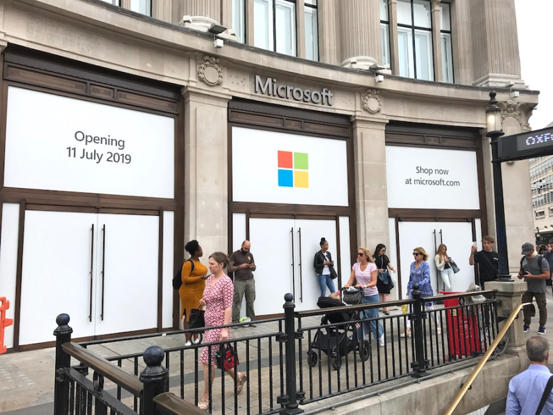
- Microsoft opened its first European store in London on Thursday.
- Its new store is just meters away from Apple’s London flagship.
- We compared the shopping experience at both stores.
- Visit Business Insider’s homepage for more stories.
Apple has a new neighbor in London – and it happens to be one of its biggest competitors.
Microsoft unveiled its first European store on Thursday, which is just meters away from Apple’s own London flagship.
We visited the two stores and see how they compare. Here’s what we found:
Our first visit was to Microsoft. We got a look in the store two days before it officially opened to the public as part of a press tour.
The new store is housed in a Grade II listed building that was designed by Sir Henry Tanner in 1912. It’s the only building on Oxford Circus that was not damaged during World War II bombings and its original bath stone façade is still intact.
Unfortunately, the façade was bordered up during our visit.
We were instantly impressed by the layout inside. Directly in front of the entrance is an HD video wall, which was streaming content about Microsoft’s software and products.

Kelly Soligon, general manager of Microsoft Stores, said that this is designed to "capture customer interest" and encourage pedestrians walking by to stop in.
Its minimalist style was instantly reminiscent of an Apple store.

However, there were far more distractions here.

This McLaren Senna racing car is fitted with a model simulator where customers can race its "Forza Motorsport 7" video game.
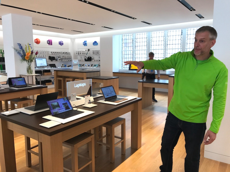
Upstairs, we found there was a wider assortment of Microsoft's Surface laptops and tablets, as well as accessories such as headphones and keyboards. There was also an area where you could come and have your keyboard cover personalized.
At this point, the store started to feel a little busier because of the mix of products and services and there weren't even any shoppers in here at this time.
During the tour, the store manager, John Carter, pointed out the "Answer Desk." This is where customers can come to receive support on new products or software and schedule repairs.
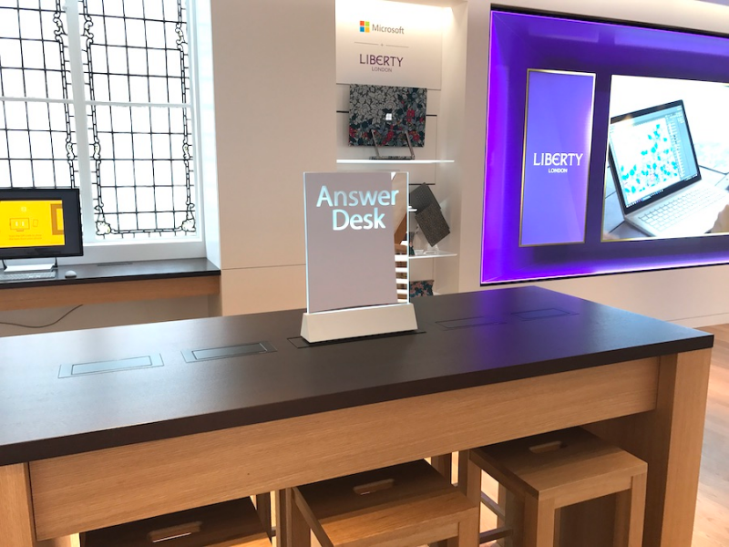
This felt almost identical to Apple's Genius Bar. However, there was considerably less space devoted to this portion of the store. In busier times, this could end up being cramped.
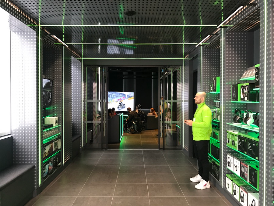
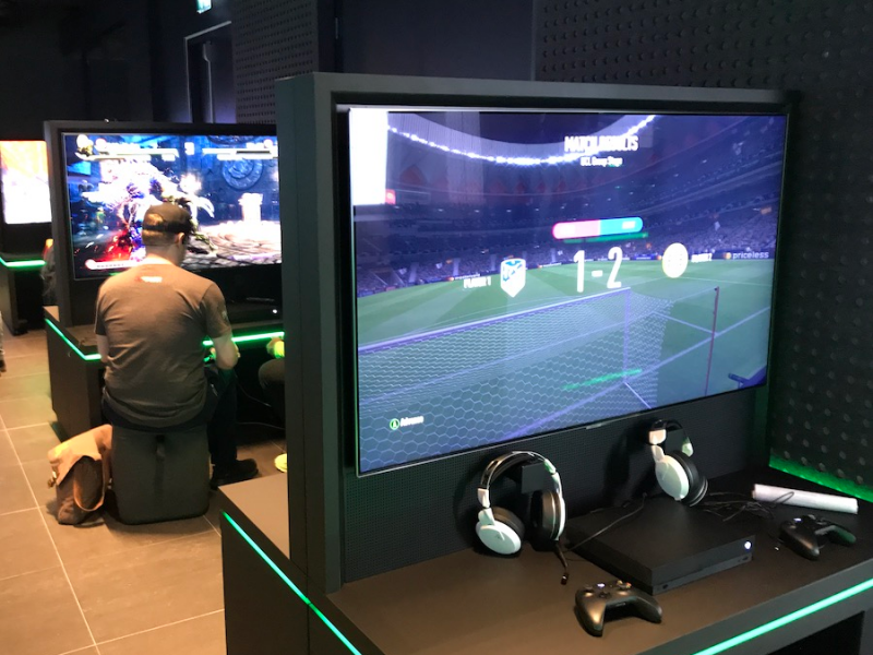
The gaming room was perhaps the most impressive part of the store and likely to be a big hit with avid gamers.

There were around 15 gaming stations set up for customers to come and play its latest Xbox games. This is a clever way to give people an introduction to its games and get them playing.
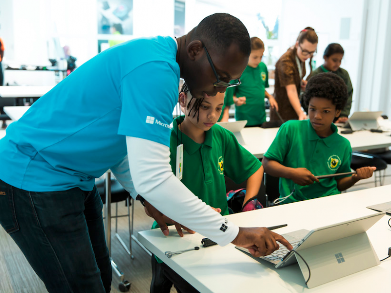
As are its workshops held in the "Community Theatre." Microsoft said it will be holding daily classes over the summer for kids and parents to teach them how to use its products and software. This helps to get kids using Microsoft devices at an early age.
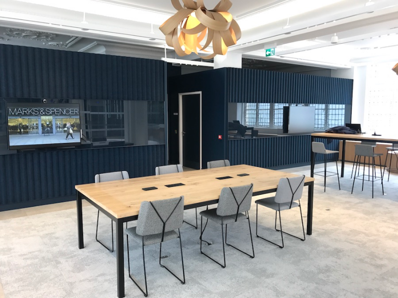
The final floor was reserved for Microsoft's business customers and is designed to be more like an office than a store. It is out of bounds to the public but it's certainly handy for any of its business clients.
On to Apple we went.
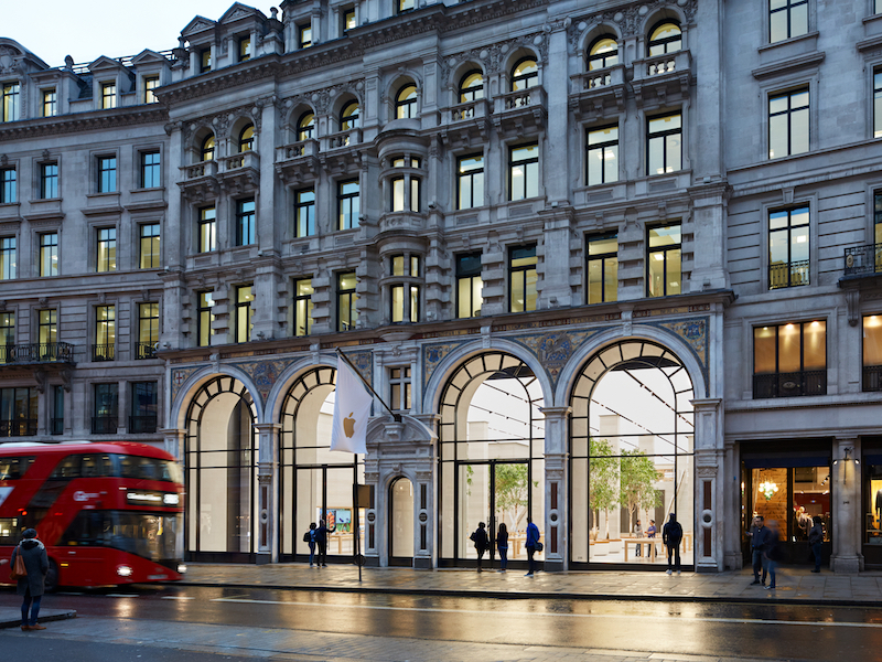
This giant store, just one block away from Microsoft, opened in 2004 but was redesigned in 2016.
Apple's stores are known for their highly minimalist design. As with its products, it's all about the simple and sleek aesthetic. The idea is to create a space where customers can easily interact with its products with minimal distraction.
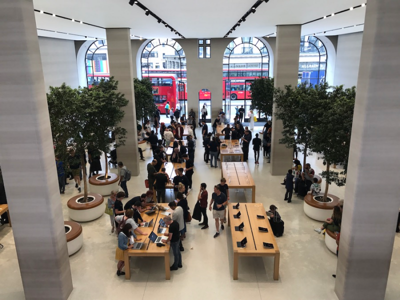
And it definitely achieves this. The store is easy to navigate and low fuss.
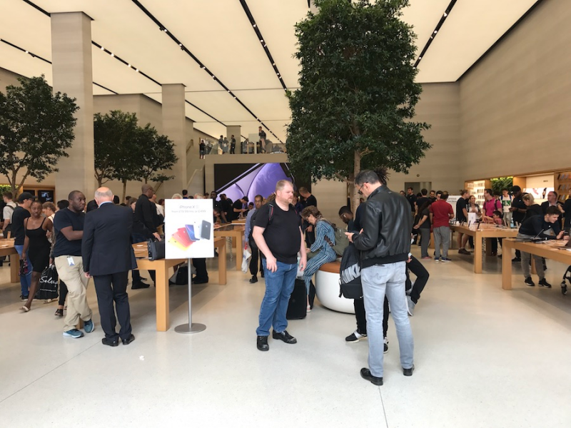
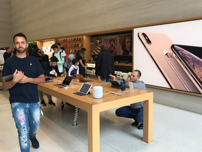
Apple has also always touted customer service in its stores. An employee immediately bounded up to us to help.
However, the new store layout, which was introduced by Angela Ahrendts who left the company earlier this year, has drawn criticism.
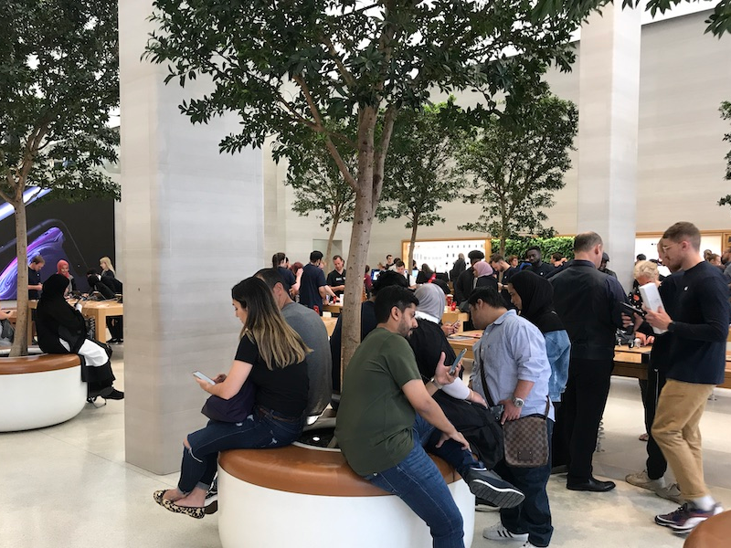
Ahrendts, who previously hailed from Burberry, set out to make the stores into luxury showrooms, eliminating lines, and creating the feeling of a "Town Square" or places where customers could congregate.
She removed checkouts and introduced a system where sales assistants would roam around the store armed with mobile devices for customers to make payments.
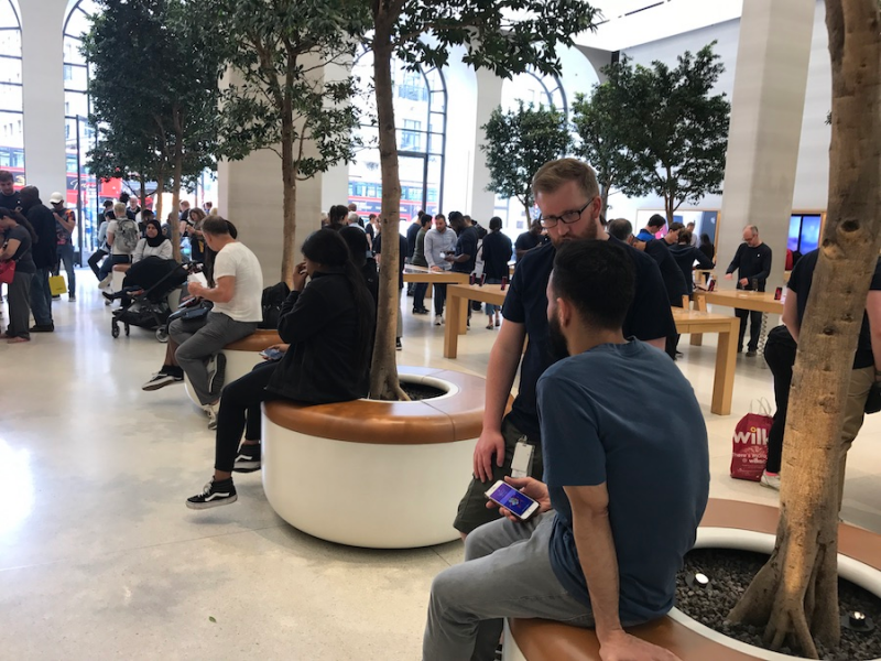
Dozens of people were sitting in the communal spaces. It wasn't clear if they are waiting to speak to a sales assistant or just taking a break.
Ahrendts also replaced its Genius Bars with Genius Groves, which are areas that were focused on repairs and assistance that didn't involve lines.

While this might sound like a good idea on paper, some customers say it doesn't work in practice and makes for a very confusing shopping experience.
While it wasn't too busy when we visited, we can imagine that during busier times it's hard to know who to talk to or how to know what your place is in line.
Despite this slightly confusing setup, Apple's store was the winner overall.
Apple's aesthetic gives it an edge over Microsoft. Its extreme minimalism and clean design meant we never felt overwhelmed in the store.