- Website design trends have changed dramatically over the past 10 years, especially when it comes to homepages.
- When more people were browsing the internet on desktops than mobile phones, designers often tried to cram as much information on a page as possible.
- A look back at the homepages of popular websites shows how text-heavy layouts have given way to vivid images and minimalist design.
The internet doesn’t look like it did a decade ago. Back in 2010, smartphones, mobile browsing, and social media were still relatively new trends. It wasn’t until 2016 that mobile browsing took over as people’s preferred way of surfing the web.
Instead, most people visited websites from a desktop computer and came in through the front door: the homepage. Web designers, who knew how valuable this real estate was, often packed the homepage full with as much information as possible. Today, that approach has given way to sparse layouts and lots of pictures that try to grab users’ attention.
As the decade comes to a close, Business Insider took a look back to see how some of the most popular websites’ homepages have evolved over the years.
In 2010, Amazon was pushing the Kindle hard and books were still its top-billed category.
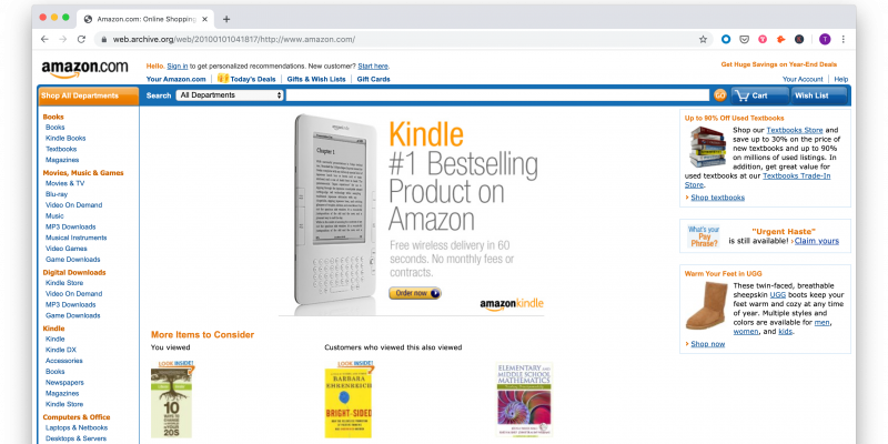
Now, Amazon doesn't even think people read books anymore. Or, maybe it's just too busy serving us up Prime videos.

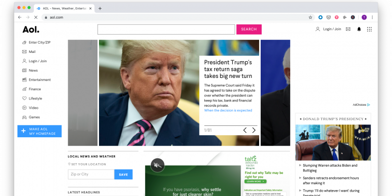
AOL's 2010 homepage left us dazed and confused with clashes of colors, nonsensical icons, and a cluttered layout.
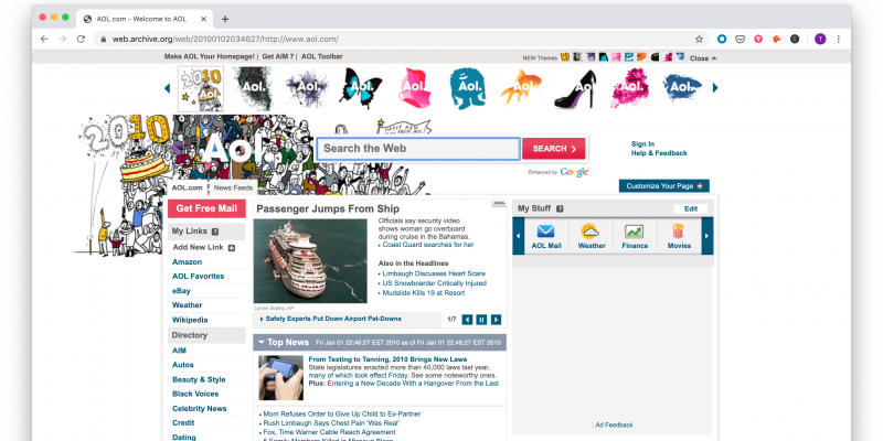
The revamp dialed it back a bit — minus that slide show with 81 slides. 81!
Apple went minimalist long before it was cool.
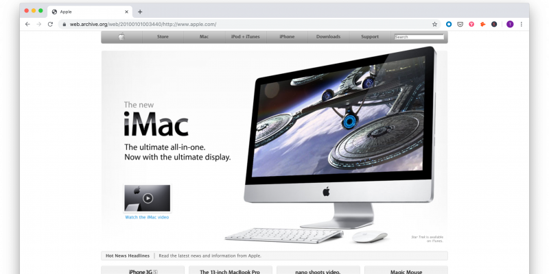
And yet somehow Apple managed to go even more minimalist...

Back in 2010, CNN still used its inside voice to give us straight news headlines and videos that weren't set to auto-play.

The refresh turned up the volume with lots of "breaking" and "trending" labels and a bigger focus on opinion, reaction, and analysis pieces.

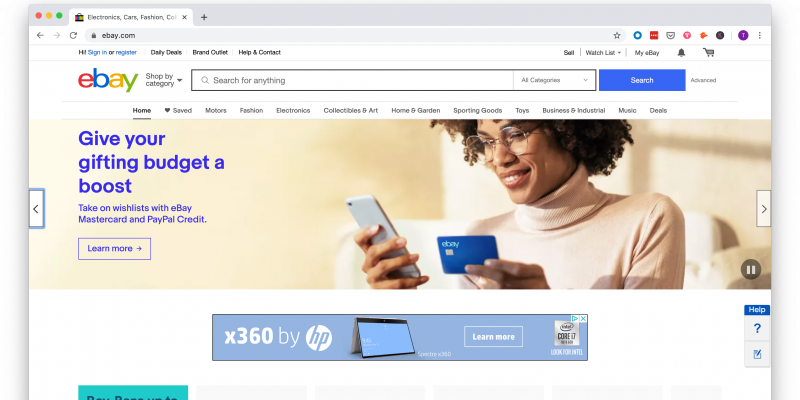
In 2010, eBay wanted us to find our next purchase by combing through a brightly colored word cloud that might as well have been written in Comic Sans.

But eBay eventually grew up, and now it wants us to get credit cards like real adults.
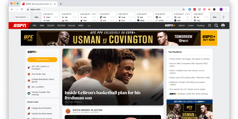
ESPN used to have a million menus to sort through — but at least most of the content was free!
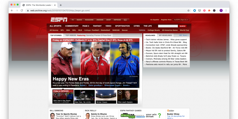
Disney, the site's new owner, really wants us to sign up for ESPN+ so we can watch all the sports. But at least they gave us that handy scoreboard for free.
Facebook used to tell us everything it knew about a person. And Zuck used to look a lot younger.
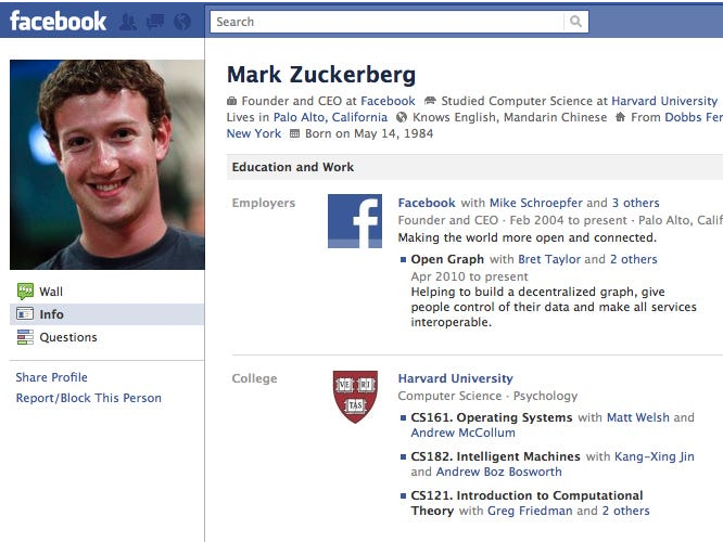
Facebook also realized people don't like reading that much and decided to place more emphasis on the "face" than the "book" part.

The Huffington Post once looked like the melting pot of the millennial internet — news, blogs, videos, and even social!

Then it got real cool, minimalist, and started dressing in all black. Oh yeah, and it goes by HuffPost now.

IMDb used to cater to us movie trivia buffs who wanted to deepen our knowledge of cinema.

Now, it knows we really just want to watch new trailers and ogle at Ryan Reynolds even if the movie is garbage.

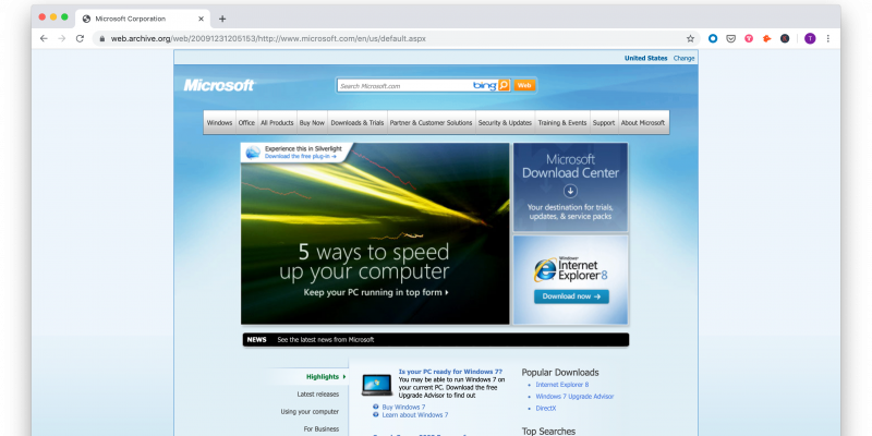
Microsoft also used to have a thing for gradients — and it was still trying to get us to use Internet Explorer.
Microsoft eventually caved to the minimalist aesthetic, too — but at least now it has some quality hardware for us to browse!

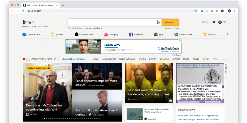
MSN used to be a go-to spot for news on the internet, even though we had no idea where to go on this website.

MSN's new site at least gave us a cleaner menu and links to popular sites. (And it's competing with AOL for the longest slideshow award.)
Remember when Netflix used to only cost $8.99? Remember when it used to ship DVDs? Remember what a DVD is?

Netflix doesn't need to mess around anymore. We all know how this works. Sign up, pay up, and get unlimited access to hit titles like 'Boss Baby' and 'Sextuplets.'

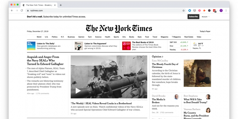
The New York Times was trying to go global in 2010. Also, it apparently felt the need to remind us we could actually click on headlines by making them all blue.

Today, the Times' site has much more multimedia content. It has everything from podcasts to videos to images to traditional text headlines to draw us in — but only so far before we hit that paywall.
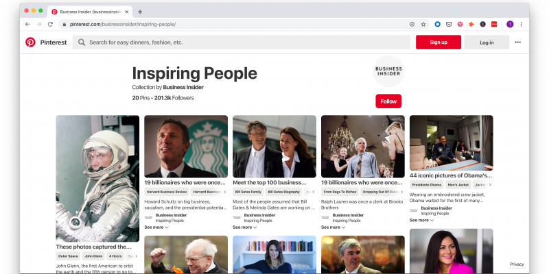
Pinterest used to be a big fan of neutral colors. Also, it made us request an invite to join. Also, Brad Pitt and baby otters — what more could we ask for?

Now, Pinterest has a much cleaner site, but also highlights the focus on metadata and tagging that allows the site to categorize images.
Reddit's design aesthetic was … no design aesthetic. No frills, few pictures, just words — as many words as it could fit on the page.
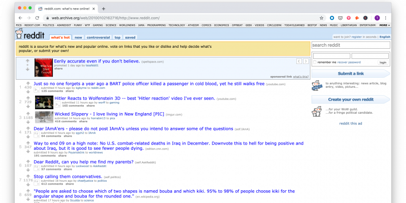
Reddit finally introduced some graphic elements and much-needed spacing, without sacrificing its popular news feed format.

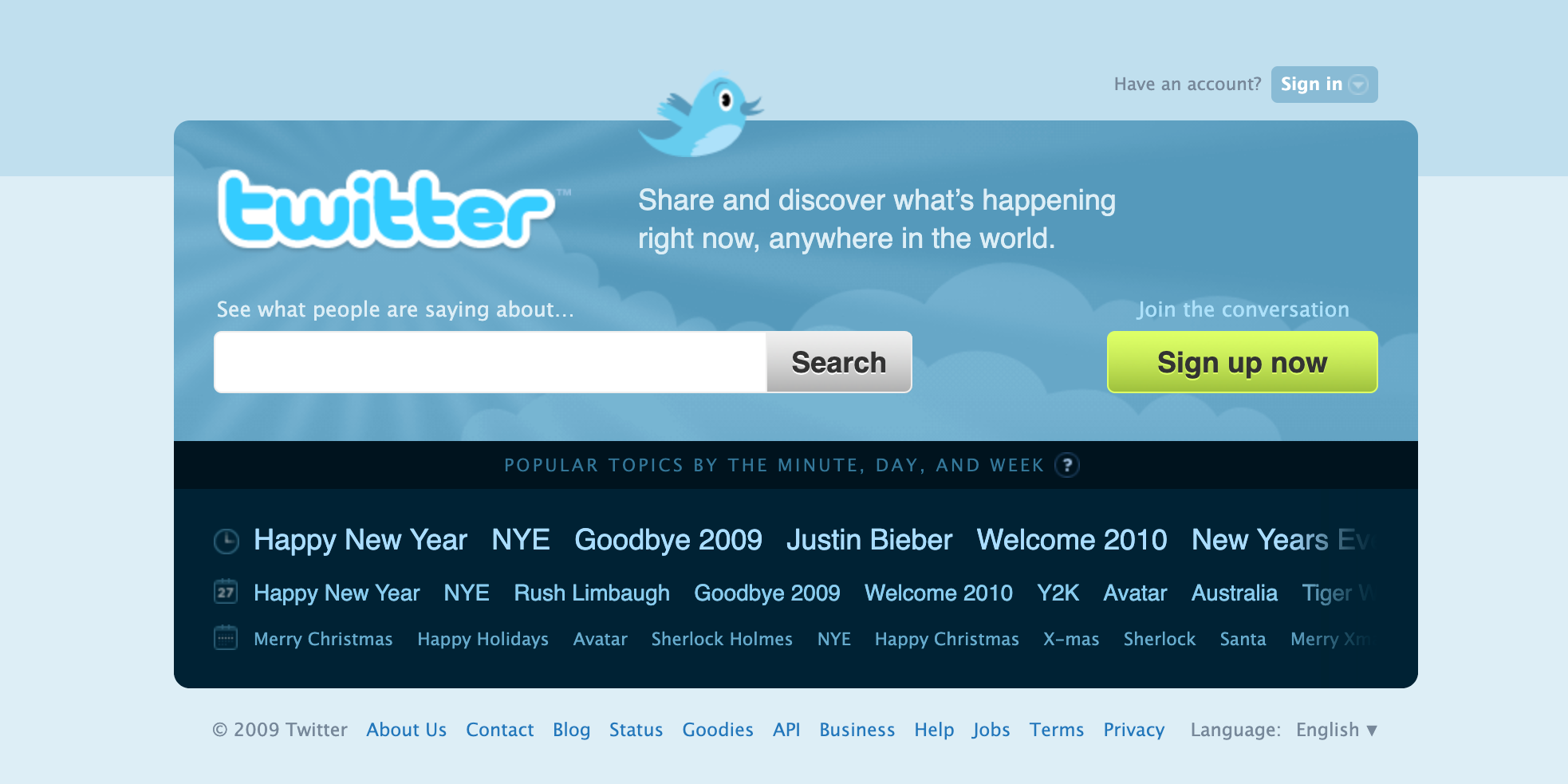
Twitter was just a few years old in 2010, as we can tell from the cute baby bird, bubble-letter logo, and friendly reminders of what the site even did.
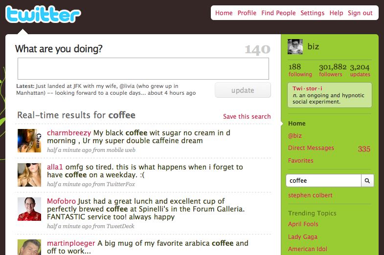
Twitter's look has gotten a bit more sophisticated since then — and the bird got a haircut.

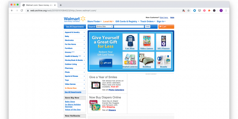
Walmart had a surprisingly simple and easy to navigate website by 2010 standards.
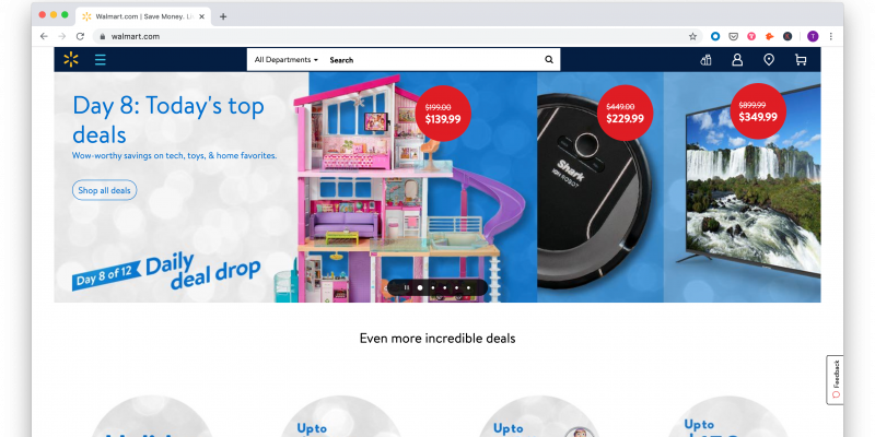
Walmart also caught the minimalist craze and discovered the importance of pictures. But it still wants us to know it has tons of deals — that hasn't changed.
The Weather Channel's website used to have some killer graphics.

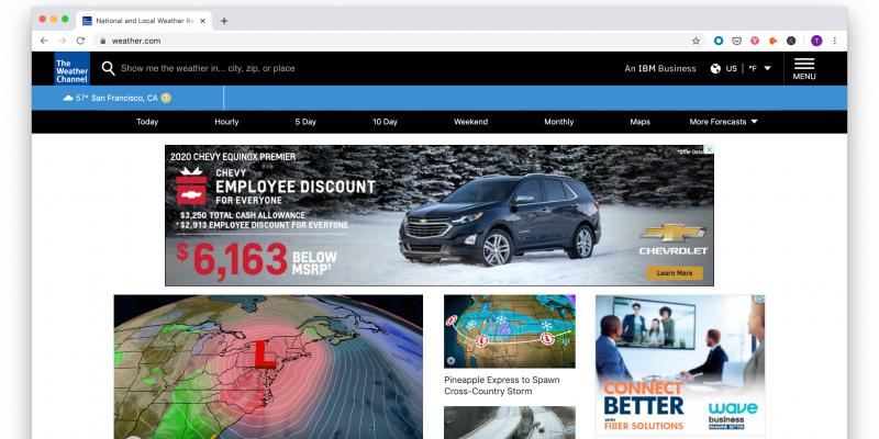
The Weather Channel's website still has some killer graphics.
WebMD wanted us to know that there are a lot of health conditions we might have — and that it has answers.

Now WebMD just gets straight to the point about reminding us that we're only here because we're sad and sick.

Yahoo had lots of fun little icons to remind us about all the things we can do online.

Now, Yahoo looks like a serious news site (but somehow we can't move past that wayward exclamation point).

YouTube looked like it was still a rough draft in 2010. Also, it really liked to use borders.

In 2019, YouTube has its own video awards show, its website is dominated by images, and its algorithm operates sneakily in the background.

Just like Facebook used to be "The Facebook," Business Insider used to go by "The Business Insider." Also... more gradients.

Eventually, Business Insider — like most websites on this list — discovered that images speak a thousand words and a thousand words don't belong on a homepage.