
- A recent graph from Georgia’s Department of Public Health mixed up times and locations in what appeared as a consistent decline of case counts in the state’s hardest-hit counties.
- The DPH later updated the graph to showcase counts in chronological order after criticism that included a state representative sending a letter to the governor’s office.
- The “misleading” graph is just one of Georgia’s data failures as it reopens businesses during its coronavirus outbreak, the Atlanta Journal-Constitution reported.
- Visit Business Insider’s homepage for more stories.
On the coronavirus data webpage for the Georgia Department of Public Health, one of many brightly colored graphics shows COVID-19 cases over time in the state’s five most affected counties.
But the first iteration of the graph followed neither time nor county. Instead, the data was arranged to give the impression of neatly descending case counts.
Local reporters began to take notice on May 10. Stephen Fowler, a reporter for local radio station GPB News, pointed out on Twitter the inconsistent data representation.
From left to right, the graph begins on April 28, goes back in time to April 27, then jumps two days ahead to April 29. This date-hopping continues down the horizontal X-axis. What’s more, the colored bars – with each color representing a county – are arranged in different orders for each date.
I’ve deleted this tweet from a week ago because it keeps getting aggregated and re-shared out of full context of what it does/doesn’t say.
There was a bad graph. DPH was asked and it changed after a day. This was one of many graphs on their site (and one of many errors) pic.twitter.com/lF3AsFQIIl
— stephen fowler (@stphnfwlr) May 18, 2020
The graph seems to bend both time and place to achieve a clean descending-staircase effect.
"It's just cuckoo," Democratic state Rep. Scott Holcomb, of Atlanta, told the Atlanta Journal-Constitution. "I don't know how anyone can defend this graph as not being misleading. I really don't."
Holcomb sent a letter to the governor's office about the graph on Monday.
"This data is being used to inform state policy, and it's also being used by individuals," Holcomb wrote in a Facebook post about the graph after sending the letter. "It's incredibly important for the data to be as accurate as possible and to be presented in a manner that is not misleading."
'Never ever ever again'
However it appeared in the original graph, the data does not actually depict a clear downward trend.
The Georgia DPH has since updated the graph, below, to progress chronologically from left to right, and to keep the counties in the same order for each date.
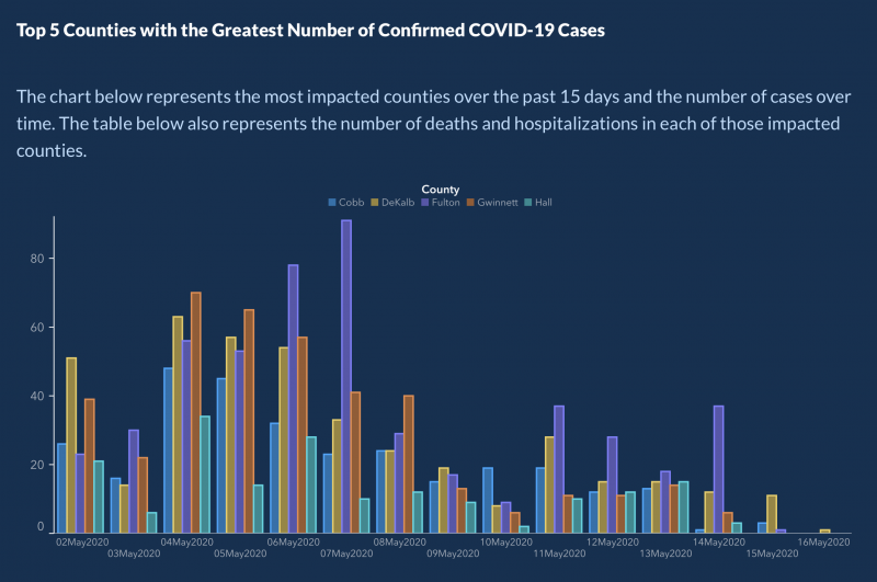
"The X-axis was set up that way to show descending values to more easily demonstrate peak values and counties on those dates," Candice Broce, communications director for Gov. Brian Kemp's office, tweeted on Monday. "Our mission failed. We apologize. It is fixed."
It's unclear how the original graph ended up so out-of-order. Broce told the Journal-Constitution that the governor's office does not choose data that the DPH publishes. The outlet also reported that a DPH spokeswoman said there was an error in how the graph sorted dates. Holcomb said on Facebook that he'd been told a vendor that publishes data on the website had chosen it.
The Georgia DPH and Kemp's office did not immediately respond to Business Insider's request for comment.
Cody Hall, Kemp's Press Secretary, said on Twitter that the data team had thought the graph "would be helpful," though it had "obviously" turned out not to be.
"Never ever ever again will we have a graph with an X-axis that is not chronological on the website," Hall wrote. "Never. I promise. I swear."
Incomplete data may have informed Georgia's reopening

Beyond other data mishaps that the Journal-Constitution cited - changing criteria for case start dates, changing color coding for a county-by-county case map, and temporary data errors on the website - Georgia's reopening strategy might be based on a fundamental misinterpretation of data.
It takes time to process coronavirus tests, and Georgia backdates cases to the date the patient first showed symptoms. So the state government may not know how many cases were confirmed on a given day until two weeks have passed.
Currently, DPH graphs showing cases and deaths over time make a clear distinction, noting that data from the last 14 days is still in progress.
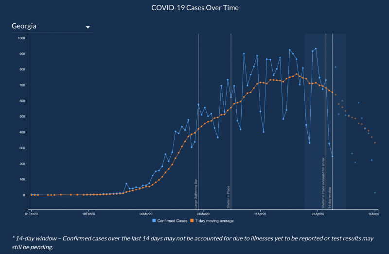
However, these graphs had previously presented the incomplete data as a continuous part of the larger curve. Holcomb said the DPH changed the graphs to their current form after he mentioned them in his letter on Monday.
"The shaded areas on the right show data that exists so far, but this should not be relied upon because it is incomplete," Holcomb wrote on Facebook. "We need to continue to monitor and watch how the curve develops."
Kemp appeared to take that incomplete data at face value as he allowed businesses to reopen across the state, two researchers at the Georgia Institute of Technology's School of Biological Sciences argued in a May 15 article for Slate.
Kemp asserted that the number of new cases in Georgia was declining when he announced reopenings at the end of April. However, "Georgia was, and still is, in a 'plateau'-like trajectory," according to the researchers, Stephen Beckett and Joshua Weitz.
"If decision-makers in the state of Georgia want to use evidence-based criteria to continue to reopen, they must not conflate reporting lags with actual declines to suit preferred narratives," Beckett and Weitz wrote. "Instead, they must deal with the evidence as it is."