

New 2016 election data released this week shows where Democratic nominee Hillary Clinton and Republican President-elect Donald Trump won and lost.
After each of the last four presidential elections, University of Michigan physicist Mark Newman produced a series of maps showing the results while rescaling states and counties by population. The results are fascinating and show a country largely split between deep-blue cities and a scarlet-red countryside.
Here are Newman’s maps showing the results of the 2016 election:
Here’s the basic Electoral College map, with states that Clinton won in blue and states that Trump won in red (assuming that Trump’s narrow lead in Michigan holds).

Foto: source University of Michigan/Mark Newman
But, of course, the US population is not evenly distributed among the states. This map distorts the sizes of the states to reflect their varying populations.

Foto: source Mark Newman/University of Michigan
Populations alone don’t win presidential elections; Electoral College votes do. This map sizes states based on number of electoral votes. It’s similar to the population-weighted map, but some smaller states like Wyoming and Vermont are somewhat bigger, while more populous states like California and Texas are a bit smaller.

Foto: source Mark Newman/University of Michigan
States themselves are not monolithically blue or red. Here’s the projected winner in each county in the US. At first glance, there are a handful of blue islands, mostly concentrated along the coasts, surrounded by a sea of red.

Foto: source Mark Newman/University of Michigan
But many of those blue counties contain dense cities. Resizing counties by population, it becomes a little clearer why Clinton is likely to narrowly win the popular vote while losing in the Electoral College.

Foto: source Mark Newman/University of Michigan
Counties themselves aren’t uniformly blue or red. Looking at a color gradient using varying shades of purple, most counties had a tight split between Republican and Democratic voters, although a few islands of deep red and blue still remain.
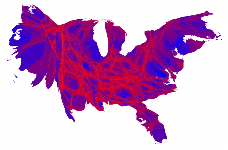
Foto: source Mark Newman/University of Michigan
Foto: source Business Insider/Andy Kiersz, data from US Census Bureau
Now check out 22 maps that explain America