- Major companies like Pepsi and Gap have had some howlers over the years with some terrible logos assaulting our eyes.
- There are plenty of worrying designs out there though which range from the poorly thought through to the downright outrageous.
Business Insider has compiled the worst corporate logos of all time – from the lame, to the inappropriate to the downright outrageous.
It’s a sign that bad design knows no limits with plenty of countries and industries represented. Here is the list:
A controversial games

It was London’s big moment to shine in 2012 as it hosted its third summer Olympics, the most of any city.
But when London unveiled its £400,000 2012 logo design, the masses were unimpressed.
The zig-zagged blobs were immediately criticised by some as looking like a swastika, while Iran threatened to boycott the Olympics altogether believing that the logo spelled out "Zion."
Others suggested that it looked like a weird amalgamation involving The Simpsons.
Regardless of these controversies the logo was seen as a major fail on what was an otherwise incident free Olympics.
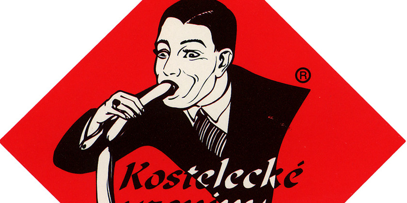
Balloon animal or sausage producer?

Czechia's largest sausage manufacturer has been in business since 1917 despite having a fairly worrying logo which at best looks like someone who has never eaten a sausage before.
"Cover the earth"

Since 1906 Sherwin Williams' sinister logo has been covering the world in blood red paint. "Cover the earth" in the creepiest way possible.
Maple syrup straight from the tap
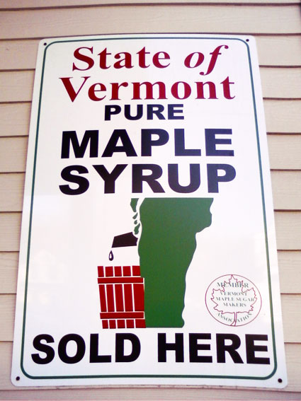
Taking away Canada's maple syrup crown was never going to be easy but Vermont's state outline - which looks a lot like legs and hindquarters - seemingly urinating into a bucket, probably isn't the way to go about it.
Lacking in detail

The best way to advertise your attention to detail is to draw a very rudimentary car for your design garage, right? It's unclear how effective as a business strategy this is, but presumably the costs involved in paying for this logo saved funds for other parts of the company.
Seattle's Best Coffee
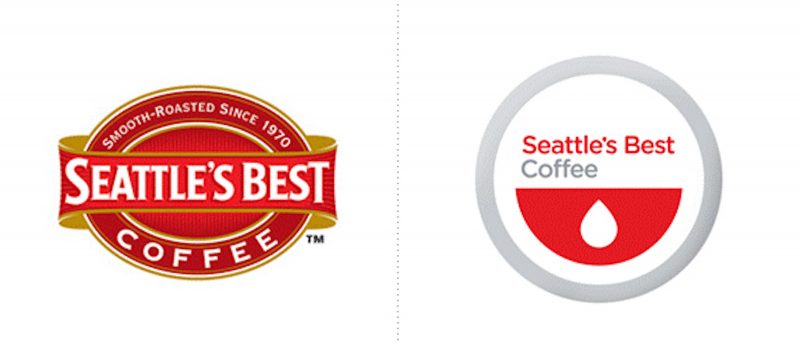
The Starbucks subsidiary's decision to redesign its iconic logo in 2010 drew the immediate and intense ire of discerning fans. Some described it as an insult to the brand, while others said it looked like a red smiley face with its tongue out - whichever way you look at it, it's not great.
Gap

Changing corporate logos was even more of an ordeal for clothing brand Gap in 2010.
The company swapped its signature blue background for Helvetica with a blue patch. The redesign was met with scorn and forced a reversal from Gap, which swapped back to its original logo within a week.
Pepsi

Pepsi spent $1 million to tilt their logo slightly on its axis in 2009 and in doing so caused all sorts of mean responses with some saying it resembled an obese man.
You can read a hilarious dissection of the logo fail here.
Kidsexchange

Another great example of failing to take the time to fully check your work before submitting. Kids Exchange may well be a lovely thing but combining them together ... not so much.
Cats wear

This Maine-based retailer probably felt like they were doing everyone a favor with its out-there logo but, instead gave the world a very unappealing image of wearing clothes reminiscent of a cat's behind.