

America’s population is growing and dynamic.
Families have births and deaths, Americans migrate from state to state, and hundreds of thousands of immigrants from the entire world move to the US every year.
The US Census Bureau keeps track of those changes. The Bureau recently released their annual estimates of population changes in each of the 50 states and Washington, DC between July 1, 2015 and July 1, 2016.
Using those estimates, we made a series of maps showing the major components of population change, as well as the overall change, across the country.
Natural population change is the difference between the number of births and the number of deaths in a state
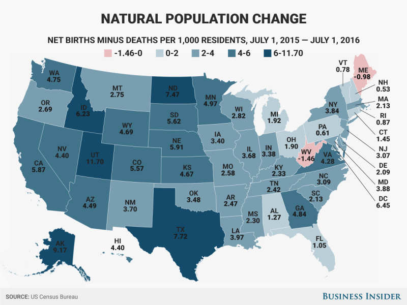
Only two states – Maine and West Virginia – had more deaths than births between July 2015 and July 2016. Births exceeded deaths at a higher rate in western states than in eastern states.
Net domestic migration measures people moving from one state to another

The Northwest, Mountain West, and Southeast were the big winners, while states in the Northeast and Midwest saw more people move out than move in.
Net international migration measures immigration from other countries and emigration to other countries

While every state had more immigration from other countries than emigration out of the US, the District of Columbia, Massachusetts, New York, and Florida had the highest net migration rates.
Combining those three components — natural change, domestic migration, and international migration — gives the overall population change in each state

Most states added population. Eight states - West Virginia, Illinois, Vermont, Connecticut, Wyoming, Pennsylvania, Mississippi, and New York - saw a net loss of population.