- Phone location data from millions of Americans’ devices shows how COVID-19 shutdown orders are impacting people’s mobility across the country.
- The data, gathered by location analytics firm Cuebiq, shows that millions more Americans have started leaving home and traveling to different counties in recent weeks as states reopen.
- Meanwhile, people are moving less in eight states that remain shut down.
- Cuebiq’s data also shows which counties have seen the largest influx or exodus of people in recent months, which could indicate that people have fled big cities and traveled since the outbreak.
- Visit Business Insider’s homepage for more stories.
As some states start to reopen businesses and relax stay-at-home orders, millions of Americans are already starting to move around more and travel to other counties, according to aggregated phone location data.
Last week, Americans in nearly every part of the country began leaving home more frequently than they were in the two months prior, according to the data. The trend was noticeably higher in states that have reopened compared to those that remain shut down.
Location analytics firm Cuebiq compiled location data from millions of people’s devices to create a dashboard that shows how much people are moving or staying still. The company estimates the “home” of a smartphone by determining where the device remains in place over time, and defines any travel within 100 meters of that location as “staying home.” Similar efforts have been launched by tech companies like Google and Apple, but Cuebiq’s tools allow for more granular comparison between states and counties.
Mobility is gradually increasing even in states that haven’t reopened. In the month of March, the number of people leaving home in New York was 67% lower than the same time the previous year – but in the past week, mobility in New York was just 29% lower than last year’s average.
"Mobility during the pandemic is increasing as state restrictions begin to lift," Cuebiq founder and CEO Antonio Tomarchio told Business Insider. "It's very interesting to see the travel routes that have been affected by COVID-19 and it will be interesting to see what the rebound will be in the coming weeks."
Cuebiq, like Google and Apple, tracks location data using software built into apps that people download. The practice has faced backlash from some privacy advocates, but location data firms and their partners insist that people's movements are anonymized and aggregated, and not directly tied to their identities.
Here's what the data shows about how Americans are moving around amid COVID-19.
Mobility data from mid-March, when most states were instructing businesses to close and people to stay home, shows decreased mobility compared to the year prior. Orange indicates more mobility while blue indicates that more people are staying still.

Cool colors indicate how much lower people's mobility is than the same time period a year prior. This map shows mobility for the week following March 15.
By contrast, data from the past week shows far more mobility, with some counties experiencing even more people moving around than the year prior, reflected by more orange counties.

This data is from the week following May 5.
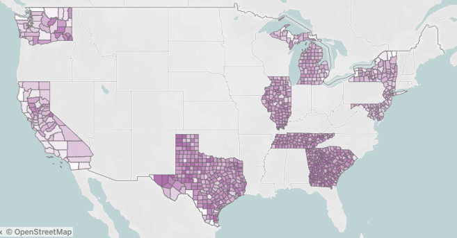
This map shows phone mobility data from states that are still shut down compared to some of the first states to reopen. Darker purple indicates higher average mobility.

California, Washington, Illinois, Michigan, New York, New Jersey, Maryland, Delaware all remain shut down. Meanwhile, Texas, Georgia, South Carolina, and Tennessee were among the first to reopen.
Cuebiq also maintains a dashboard for "mobility flows," which indicates the counties that have seen the most people arriving or departing from other counties. Dark purple indicates more arrivals.

While the mobility flow data can provide a rough sketch of where people are moving, it's not enough data to definitively say where Americans moved amid COVID-19 shutdowns. Tomarchio said Cuebiq is working on a new feature to better illustrate "origin-to-destination mobility flows at the state and county level."
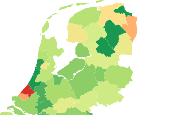
Cuebiq also created a social inequality tracker that shows disparities between mobility across poor neighborhoods and rich neighborhoods. Regions highlighted in orange have the highest disparity, while gray regions have less disparity in movement across income levels.

Cuebiq combined location data with census data to approximate disparities between high- and low-income areas. The data shows that, across the US, people in poor areas have seen higher mobility - a trend that tracks with reports that working class Americans more often lack the flexibility to work from home or shelter-in-place.
Check out Cuebiq's full dashboard here.