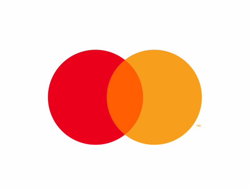
- Mastercard has dropped the words “Mastercard” from its logo.
- It will now appear as just the two intersecting circles of red, yellow, and orange in the middle.
- The move comes as digital payments rise and Mastercard tries to get customers to view it as a tech company instead of a credit-card company.
Mastercard is betting customers will know the company by its shiny interlocking circles.
The credit-card network and financial-services firm announced on Monday it will drop the name “Mastercard” from its logo. Instead, the logo will appear as two intersecting circles of red and yellow, with orange in the middle, on payment cards, sponsorships, and logos in stores where the card is accepted.
It’s the latest change for the company’s constantly evolving logo. The name went from being featured in the middle of the logo to, in its latest iteration before this one, being located underneath it in a sans-serif font. It also reflects a changing landscape in payments, where customers are increasingly paying without any kind of physical swipe or insert. More than ever, payments are done by inserting payment details or by swiping a phone, and the word “card” might feel a little old-fashioned.
"As the consumer and commerce landscape continues to evolve, the Mastercard Symbol represents Mastercard better than one word ever could, and the flexible modern design will allow it to work seamlessly across the digital landscape," the company wrote in a press release.
Read more: The biggest way shopping changed this year combined the best parts of online and in-store
The company also increasingly wants to be seen as a financial-tech firm instead of simply a credit-card network. In the release announcing the logo change, Mastercard calls itself a "digital payment company."
If successful, the move will make Mastercard one of the few companies that can be identified by just its logo, such as Nike and Apple.