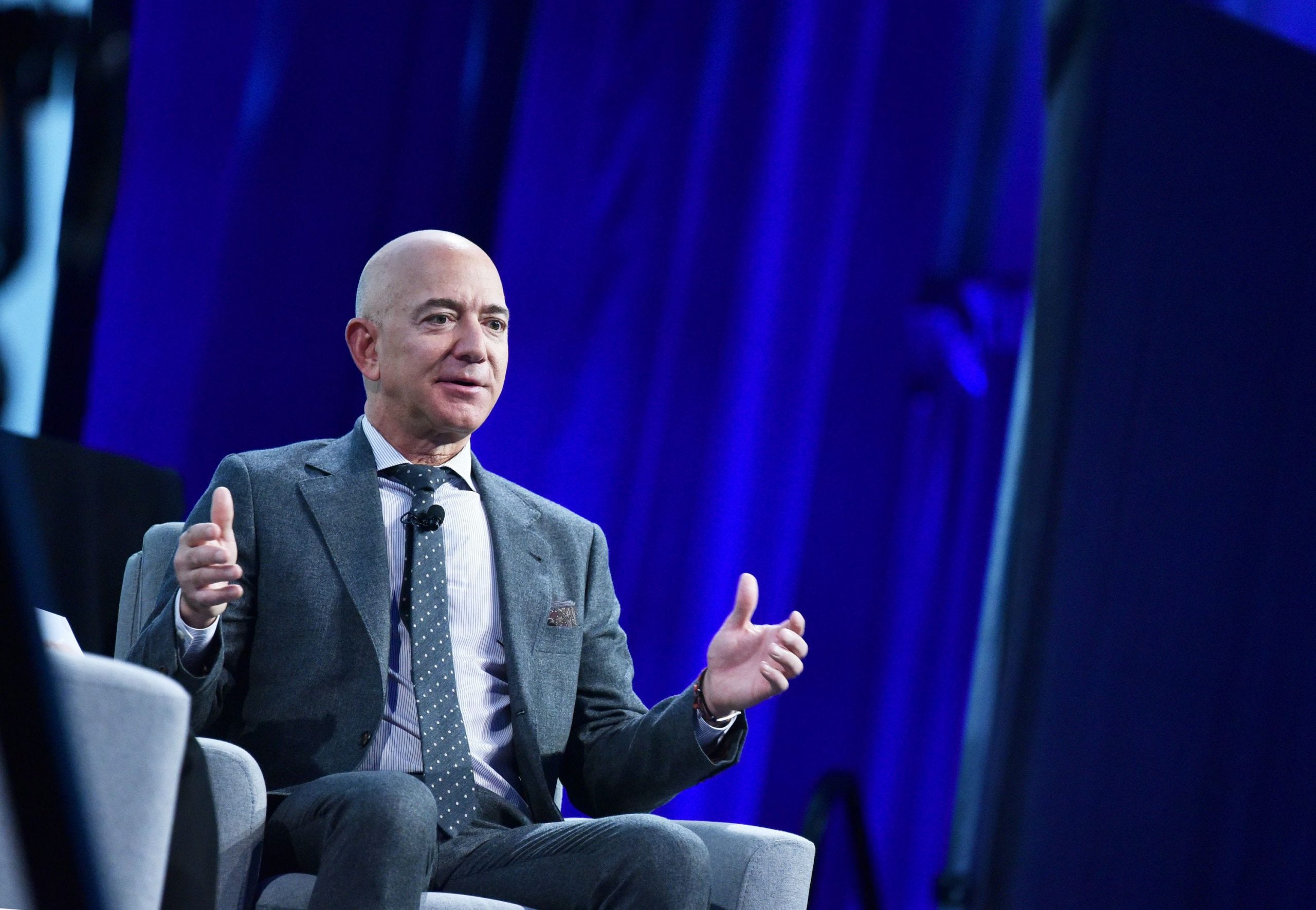
- Bezos was beaming when he saw the new smile logo for the first time in 1999, Fast Company reported.
- The designers said at the time the smile could one day function without the word "Amazon."
- As designed, the logo indicates the company sells everything from A to Z.
- Visit the Business section of Insider for more stories.
When Amazon CEO Jeff Bezos saw the company's potential new smile logo in 1999, he knew that was the one.
He was beaming, expressing how much he loved it: "This is it," he said, according to a Fast Company feature published March 5. Bezos then laughed and said "anyone who doesn't like this logo won't like puppies," and walked out, the magazine said.
The Fast Company piece documented this little-known anecdote from the e-commerce behemoth's beginning days as an online book seller. The company's first logo read "Amazon.com" with a slight frowning orange line below. Then, more than two decades ago, Bezos met with a branding agency and shared his grandiose plans for Amazon to sell everything — even furniture, the article said.
The company came back with a logo that dropped the ".com" and flipped the swoosh into the famed smile recognizable worldwide today. The smile points from A to Z, a message indicating the range of products now sold on the platform.
Though Amazon has stuck with the smile since that pinnacle meeting, the branding has continued to change. For example, the company dropped "Amazon" from its Prime brand. Prime Video and Prime Now also became stand-alone phrases. The smile remained with each, though the color for Prime members is a soft blue, instead of the orange. The move reflected Prime's growth to more than 100 million payers in 2018.
Recently, the company rebranded its app logo to a blue-taped box with the iconic orange smile. Critics said the logo reminded them of Adolf Hitler's mustache, so Amazon abruptly made changes to the image.
In its article, titled, "Inside Jeff Bezos's failed attempt to make Amazon 'cool' like Apple and Nike," Fast Company said Amazon's logo was a bright spot in Bezos' decades-long failed attempt at becoming a beloved brand, like Apple or Nike.
The article added that instead of a well-branded business, Bezos succeeded in designing a customer-first company with his razor-sharp focus on buyers. That design, though, has come at the expense of thousands of workers and the environment, Fast Company said.
